Types of Graphs and Charts


Types of Graphs: Many times it so happens that we are left at crossroads, and it gets difficult to decide which direction to take. While the choices might seem hard, one of them always precedes the others. This precedence might be camouflaged sometimes and may create havoc, but if analyzed well, the decision point can be reached with ease.
For such situations, when there are challenging options, graphs and charts can play a vital role. They can help us weigh the positives and negatives, pros and cons, or the percentage by which one option wins over the other.
If, for instance, we decide to go for a trip but can’t fix a particular destination, we can depend on a mobile application that gives us an array of options on the different locations. It lists out the positives of all the sites and compares them according to our wishes in charts and graphs to reach a constructive conclusion.
Although chats can help us determine a better choice, selecting a particular chart according to our needs might take a little effort. Listed below are the type of maps according to their uses.
What is the difference between a chart and graph?
As easy as it sounds when someone asks to list down the difference between a chart and graph, sometimes it might get a little tricky and confusing. This is because, with the help of both maps and diagrams, we can reach numerical conclusions.
A chart is a pictorial form to represent a data or data set. However, a graph always uses axes, namely the x-axis and y-axis, and can be an excellent tool to show trends over some time.
Chart vs Graph
| Charts | Graphs |
| Data or data sets are represented pictorially. | Numerical relationships are shown by plotting them on axes (x-axis and y-axis). |
| All types of charts are not graphs, | All graphs are charts. |
| It is used to structure data. | It is used to show trends. |
| A few of the components are bars and slices. | The axes are its main components. |
The different types of charts and graphs
- Charts to show comparison
- Charts to show the distribution
- Charts to show the composition
- Graphs to show distribution between values
Charts to show comparison
Column chart
Column charts, also known as bar charts, are how each constituent is shown by rectangles. The y axis or the height of the rectangle is the value of this constituent.
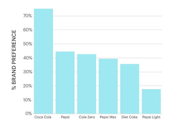
A simple column chart has been explained above. It shows that the highest percentage according to brand preference is Coca Cola with 70% while the least preferred aerated drink is Pepsi Light with a mere percentage of almost 20%.
More information about column charts
Grouped column
A grouped column chart, as the name suggests, is a collection of bar charts. Unlike column charts, it has the values of two variables or constituents instead of one.
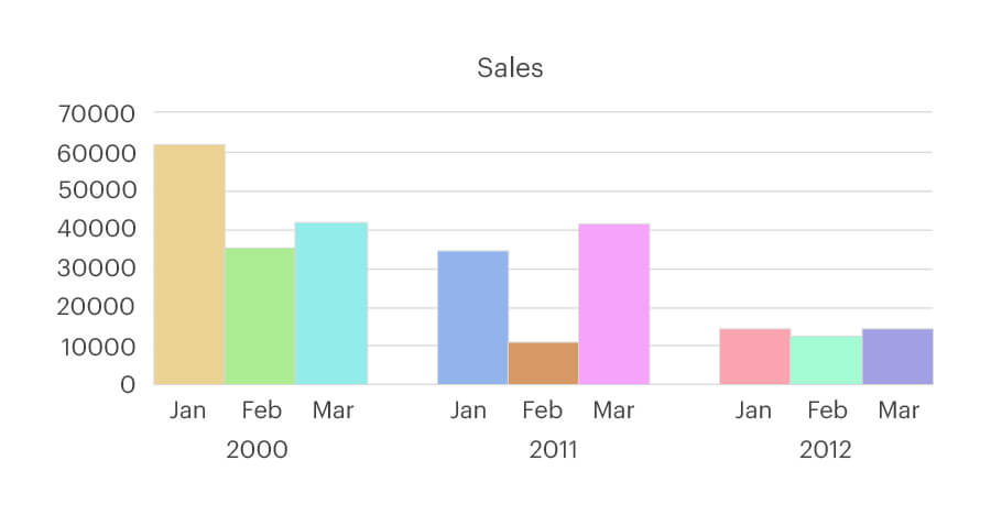
In the above example, a typically grouped column chart has been explained. The Sales of a particular company for the months of January, February and March have been explained through the years 2000, 2011 and 2012.
In the year 2000, the sales in the month of Jan was 60000, while that in Feb was 30000, and for March, the sales were 40000.
In 2011, Jan had its sales at almost 40000, while in Feb it was at close to 20000 and in March, the sales went back to 40000.
The year 2012 almost had stable sales with Jan, Feb and March all nearing the 20000 mark.
More information about grouped column charts
Bar chart
Bar charts can be plotted vertically as well as horizontally, but most often, they are vertical. They are bars showing values of different categories. They are also used for representing negative values.
More information about bar charts
Line chart
A line chart is used to show the values over a time frame. It is usually used to show how a particular value has changed over time. The data is joined over the graph to form a line.
More information about line charts
Charts to show the distribution
Box plot
Box plot, also known as a box and whisker plot, is used to show data distribution with the help of quartiles. They take less space helping in distribution between more sets and groups.
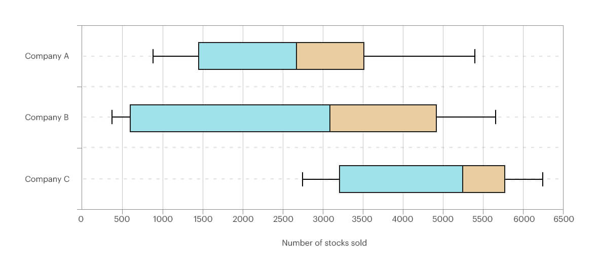
A typical Box Plot has been explained above. The x-axis represents the number of stocks sold, while the y-axis shows the three companies: Company A, Company B, and Company C.
The data distributions have been shown in terms of quartiles represented by the colours blue and orange.
All the companies have shown negative skews. This can be said because medians in all the three quartiles are towards the right.
More information about Box plot
Column histogram
In histogram charts, the values are distributed in the form of bars. The numeric value that each bar covers is known as bin or class. It is used to show the distribution. Plotting of data and calculating the frequency of a particular value from a range of values.
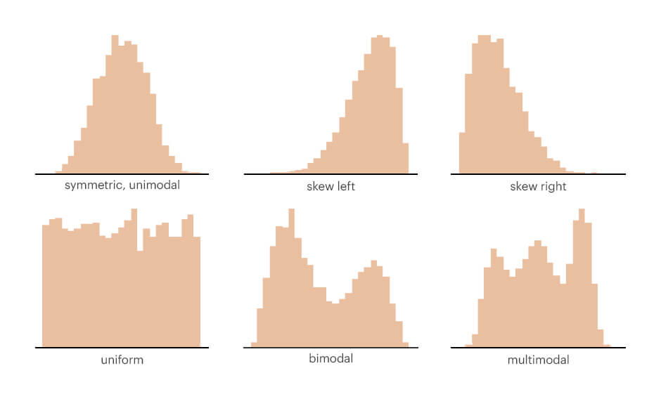
The diagrammatic representation of different kinds of column histogram has been shown in the image.
More information about Column histogram
Scatter plot
A scatter plot, also known as a scatter graph or scatter chart, uses dots to show the different values. The plots are used to establish relationships between variables.
More information about Scatter plots
Charts to show the composition
Pie chart
A pie chart is used to represent data in a circular format. In pie charts, the relationship between the whole chart and individual pieces can be found out.
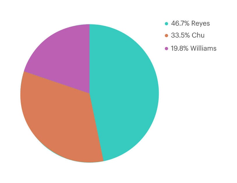
In the pie chart, the percentage of works of Reyes, Chu, and William have been represented. If the circle is considered cent percent then Reyes represented with blue is at 47.7%, the Chu covers 33.5% with brown and William has the least percentage of 19.8% with violet.
More information on Pie Chart
Donut chart
The Donut chart or Doughnut chart looks like pie charts, except that donut charts have a hole in the middle. This hole or the void can be used to show the extra data.
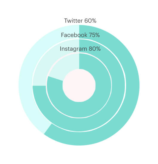
As it had been explained in the definition, the percentage of usage of Twitter, Facebook and Instagram have been explained. The donut chart is very similar to the pie chart. But in the donut chart as shown, there is an empty space in the middle. This space can be used to store extra information if required.
More information about Donut Chart
Area chart
When there is a change for a particular data over a span of time, it can be represented in area charts. Area charts are similar to line charts. In both the charts, the points are joined. However, in line charts, the points are joined together to form a line segment, while in area charts, the area between the x-axis and the line is calculated.
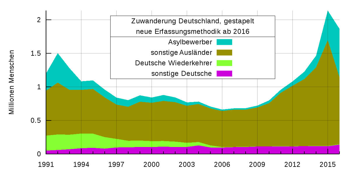
A typical area chart has been represented in the above image. The companies have been assigned particular colors like blue, brown, green, and pink. The growth has been explained for all the companies, starting from 1991, through 1994, 1997, 2000, 2003, 2006, 2009, 2012 and finally 2015.
The x-axis represents the mentioned years while the y-axis shows the growth like 0.5, 1, 1.5 and 2.
More information about Area Charts
Stacked bar
A stacked bar chart helps to compare data using bars both in segments and the whole data. It thus gives an impression of the entire data and how the data would look if it’s divided into parts.
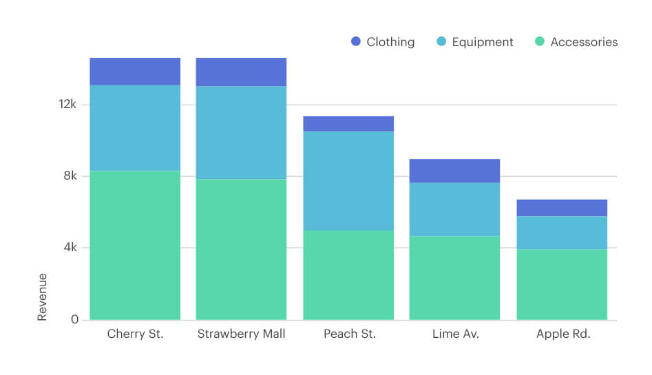
In the above image, normal bar charts have been stacked one over the other. Different departmental stores have been listed like Cherry St., Strawberry Mall, Peach St., etc.
The x-axis represents the different stores, while the y-axis represents the revenue that has been generated. The bars that have been stacked one over the other, are the different articles sold like clothing, equipment, and accessories.
More information about Stacked bar charts
Stacked percent
In these types of graphs, the rectangles are stacked one on top of the other. They are used to compare values individually with the total.
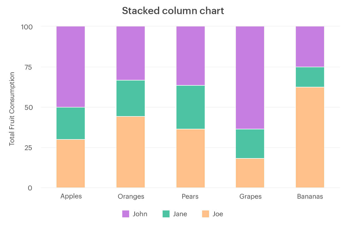
Stacked column charts and stacked percent charts are very similar to each other except as the name suggests in stacked percent charts the values are shown in percentages.
More information about Stacked percent charts
Charts to show distribution between values
Bubble chart
Bubble Charts use a cartesian coordinate system to plot variables. They are usually used to show data with three variables.
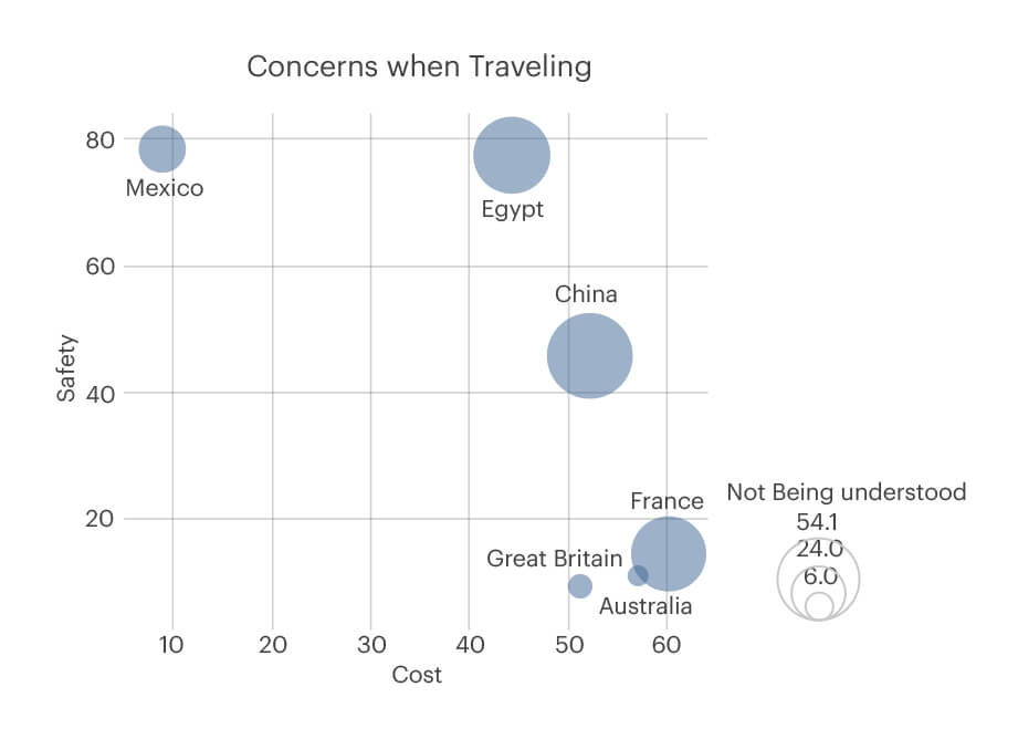
Let us consider there is a mobile application on travel destinations. The customer wants to find out which are the places that he should not consider while making his travel plans. Thus, in the chart, we can see the x-axis shows the cost which has to be paid for each location, while the y-axis represents the safety and risks for every location.
For Mexico, the cost that would be incurred might be lesser compared to the other locations but safety can be of concern. On the contrary, the cost for Australia is higher but it is the safest as regards the concerns while traveling.
More information about Bubble charts
Heat map
Heat map represents data in terms of color ranges like low, medium, or high. This makes the data easier to understand and grasp, even for someone who isn’t well versed with how to read charts.
More information about the Heat map
Data Visualization Graphs
For data visualization, the charts used are similar to the ones that have already been discussed, including column charts, bar graphs, line graphs, scatter plots.
In addition to these, a few more types of graphs can be added, which helps in comparison with the help of charts. These are:
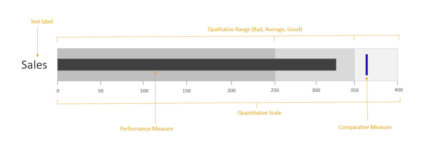
Bullet graph
Bullet graphs are similar to bar graphs but have some extra components to make them more visually appealing. It was initially developed as an alternative for meters and dashboard gauges.
More information about Bullet graph
Mekko chart
A Mekko or a Marimekko chart clarifies the overall market scenario and talks about opportunities and acquisitions. It compares values between the components and the total value.
More information about Mekko chart
FAQ: Types of Graphs and Charts
- What are the different types of line graphs?
The different line graphs are- simple line graphs, multiple line graphs, and compound line graphs.
2. What is the line in a graph called?
Also known as a line graph, it consists of the axes, namely the x-axis and the y axis.
3. What are the types of graphs in statistics?
The different types of graphs in mathematics and statistics are- Exponential Graphs, Logarithmic Graphs, Trigonometric Graphs, Frequency Distribution Graphs, Statistical Graphs.
4. What are the types of function graphs?
The different kinds of function graphs are linear, power, quadratic, polynomial, rational, exponential, logarithmic, sinusoidal.
5. What are the basic graphs?
Basic graphs are the most straightforward graphs and consist of two lines or axes, namely the x-axis and y-axis.